Typography is one of the few design elements present almost everywhere. It appears in navigation, interfaces, articles, buttons, packaging, presentations, product screens, campaigns, and brand systems. Even when a design appears to be led by imagery, typography is often quietly organizing the experience underneath it.
Because type is so familiar, it is easy to treat it as a finishing decision: choose a font, assign a few sizes, and move on. In practice, typography is doing much more structural work than that.
Typography establishes hierarchy before content is read
People do not usually read a page from the first character to the last. They scan. They notice scale, contrast, spacing, placement, and density before deciding where to begin.
Typography tells the reader which ideas are primary, which are supporting, and which can wait.
Before typography communicates words, it communicates importance.
Scale creates a map of the page
A strong type scale creates recognizable levels of information. A large headline establishes the subject. Smaller supporting text adds context. Labels and metadata become quieter without disappearing.
When those differences are too subtle, every element begins competing at roughly the same volume.
- 01Large display type can create a clear entry point.
- 02Section headings help readers understand changes in subject.
- 03Body text establishes the primary reading rhythm.
- 04Labels organize information without competing with content.
- 05Metadata can remain useful while staying visually secondary.
A typeface changes the tone before anyone reads the sentence
Words carry meaning, but their visual form changes how that meaning is received. The same sentence can feel institutional, editorial, technical, luxurious, playful, or informal depending on how it is typeset.
This makes typography an important part of brand personality. A company does not only sound a certain way through its writing. It also sounds a certain way visually.
Typography gives language a voice before the reader hears the words.
Serif and sans serif are only the beginning
Discussions about typography are often reduced to broad categories: serif feels traditional, sans serif feels modern, display type feels expressive. Those associations can be useful, but they are too general to guide an entire system.
Two sans serif typefaces can communicate completely different personalities. One may feel geometric and engineered. Another may feel human and conversational. One serif may feel literary, while another feels fashion-oriented or institutional.
The details matter: proportions, contrast, terminals, width, rhythm, and the relationship between uppercase and lowercase forms.
Line length changes how reading feels
A paragraph can use an excellent typeface and still be uncomfortable to read if the line is too long. Readers have to travel farther across the page and work harder to locate the beginning of the next line.
Lines that are too short create a different problem. The eye is forced to return constantly, interrupting the rhythm of the sentence.
- 01Long-form reading benefits from controlled text width.
- 02Large display type can tolerate shorter, more dramatic line lengths.
- 03Small labels often benefit from tighter width and stronger tracking.
- 04Responsive layouts should reconsider line length rather than simply shrinking type.
Line height controls density
Line height is one of the easiest typographic details to overlook and one of the quickest ways to change how a page feels.
Tight line spacing can make large display typography feel graphic and intentional. The same spacing applied to long body copy can make reading exhausting. Generous line height can improve legibility, but too much can break the relationship between lines that belong together.
Typography is not only the shape of letters. It is the space that allows those letters to work together.
Weight is a hierarchy tool, not decoration
Using bold type everywhere does not create stronger hierarchy. It simply changes the baseline.
Weight becomes useful when it creates meaningful contrast. A medium heading against regular body copy may be enough. A bold label can help a compact interface become easier to scan. A lighter weight can make supporting information recede.
The goal is not to use every available font weight. It is to create a small number of relationships that remain predictable.
Tracking can quietly change personality
Letter spacing is often adjusted for functional reasons, especially at very large or very small sizes, but it also affects tone.
Tightly tracked display type can feel dense and expressive. Widely spaced uppercase labels can feel controlled, editorial, or technical. Excessive tracking in body copy can make reading unnecessarily difficult.
- 01Display type often benefits from tighter tracking.
- 02Small uppercase labels may need additional spacing for legibility.
- 03Body copy usually works best close to the spacing intended by the type designer.
- 04Tracking should respond to size rather than being applied uniformly.
Typography can replace interface chrome
Strong typographic hierarchy can reduce the need for boxes, borders, backgrounds, and decorative separators.
A change in scale can establish a section. Spacing can separate groups. Weight can distinguish labels from values. Alignment can create relationships across a layout.
When typography creates enough structure, the interface needs fewer visible containers.
Good typography makes dense information feel lighter
Information density is not only determined by how much content exists. It is also determined by how clearly that content has been organized.
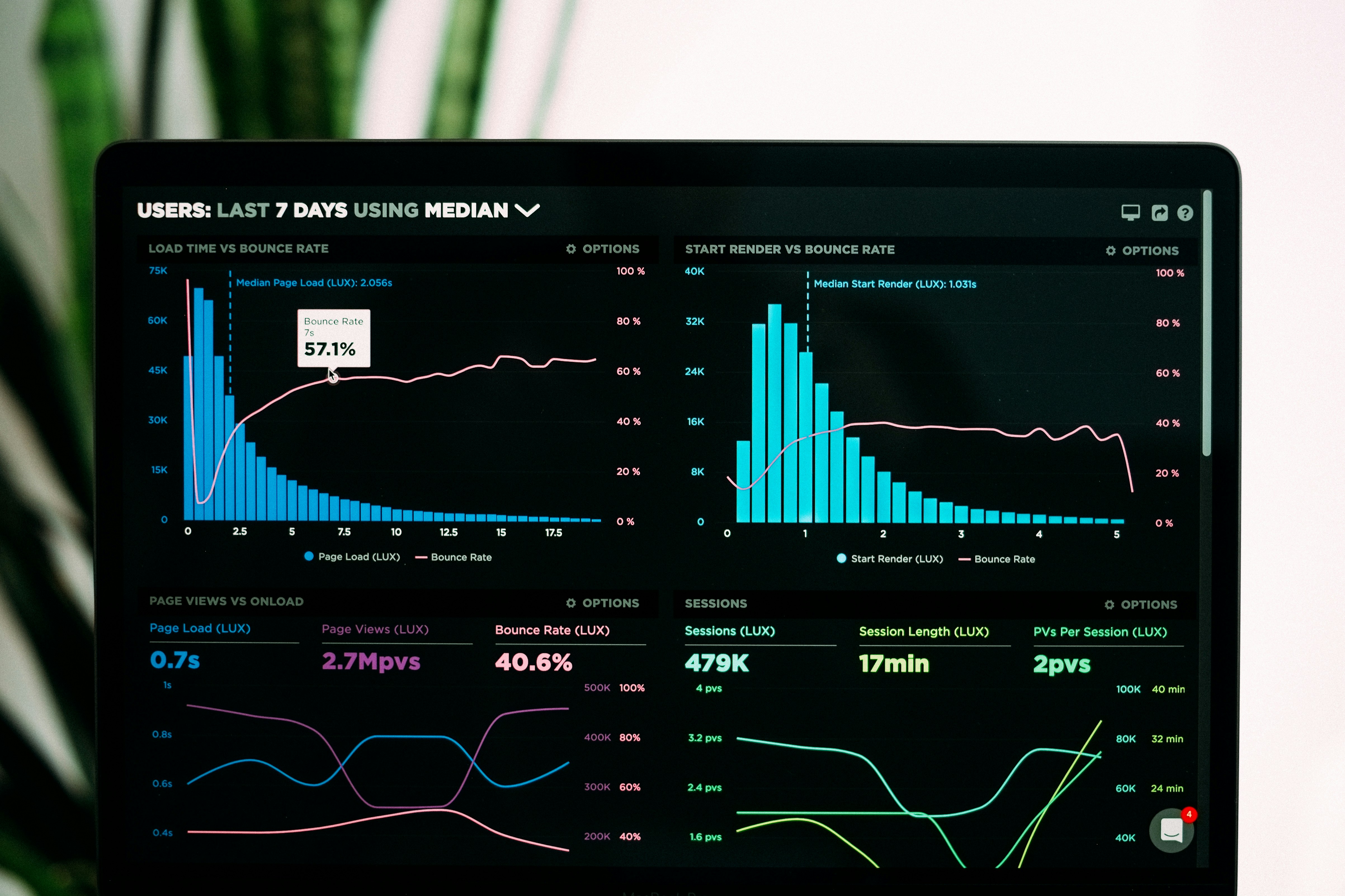
A dashboard with many metrics can still feel calm if the hierarchy is obvious. A short page can feel overwhelming if every piece of text competes at the same size and weight.
Typography allows designers to create several levels of information without introducing several levels of visual noise.
A small type system is often stronger
Design systems can accumulate type styles quickly. Display large, display medium, heading one, heading two, heading three, subtitle, body large, body small, caption, label, overline, button text, helper text, and several variations of each.
The result may be technically organized but visually inconsistent because designers have too many nearly identical options.
- 01Use enough sizes to create clear hierarchy without producing redundant choices.
- 02Define a small number of body styles for common reading contexts.
- 03Treat labels and metadata as a coherent family.
- 04Use responsive scaling deliberately instead of adding separate styles for every breakpoint.
- 05Remove styles that exist only because they were needed once.
Responsive typography needs its own decisions
Large desktop typography rarely works on mobile by simply becoming smaller. The available width changes the composition of the words themselves.
A headline that occupies two strong lines on desktop may turn into five awkward lines on a phone. Supporting copy may become too wide relative to the viewport. Labels may wrap unexpectedly.
Responsive typography should consider size, line height, tracking, width, and line breaks together.
Responsive typography is not shrinking type. It is redesigning the relationship between type and space.
Typography affects accessibility
Typography is also functional. Text that is too small, too light, too compressed, or too low in contrast can make an otherwise attractive interface difficult to use.
Readable typography becomes especially important for long-form content, dense product interfaces, and experiences used in challenging environments or on smaller screens.
- 01Avoid relying on extremely light weights for important content.
- 02Maintain sufficient contrast between text and its background.
- 03Give body copy enough size and line height for sustained reading.
- 04Avoid placing essential text over visually unpredictable imagery.
- 05Make links and interactive text distinguishable through more than subtle color differences.
Typography can create rhythm across an entire website
A website feels more coherent when similar content uses similar typographic relationships. Case study titles behave consistently. Metadata occupies the same visual level. Section headings create a predictable cadence.
That rhythm helps visitors understand new pages faster because they have already learned part of the visual language.
The best font choice will not rescue a weak system
Designers sometimes spend considerable time searching for the perfect typeface when the larger problem is hierarchy.
A distinctive font used without discipline can still create a weak experience. A relatively neutral typeface used with excellent scale, spacing, width, and hierarchy can produce remarkably strong design.
Typography becomes distinctive through how it behaves, not only through which font file was chosen.
Type is part of the architecture
Typography should not be considered after the layout has already been designed. The amount of space a headline occupies affects composition. Paragraph width determines column structure. Navigation labels affect how much room the header needs.
Type is part of the architecture of the interface, not content poured into empty boxes afterward.
Notice what typography is already doing
When evaluating a design, it can be useful to temporarily ignore the meaning of the words and look only at their visual relationships.
Can you identify what matters first? Are related ideas grouped together? Does the page have a readable rhythm? Do secondary elements actually feel secondary? Is there enough contrast between levels?
If those relationships are working, typography is already doing much of the design before the reader understands what any of it says.