01
Design6 min read
The Case for Designing Less
More screens, more features, more sections, and more visual ideas do not automatically create a better experience. Often, better design begins by deciding what does not need to exist.
Jun 15, 2026Bivi
The most refined design often appears effortless because complexity has been resolved before it reaches the surface. Simplicity is frequently the result of more decisions, not fewer.
Written by
Bivi
Published
Jun 23, 2026
Reading
7 min read

There is a particular kind of design that looks almost obvious once it is finished. The typography feels inevitable. The spacing appears effortless. The color palette is restrained. There are fewer visible elements than expected, and nothing seems to be working especially hard for attention.
That simplicity can create the impression that the design itself must have been simple to produce. Often, the opposite is true.
Adding another element is usually easier than deciding which element can be removed. Adding another color is easier than building enough hierarchy with two. Adding another section is easier than determining whether the information belongs there at all.
Refined design often represents a long sequence of decisions that the viewer never sees.
Simplicity is often what remains after the difficult decisions have already been made.
Every product, service, interface, or brand contains complexity. The question is whether that complexity is resolved by the people creating the experience or transferred to the person using it.
A complicated navigation system may reflect unresolved organizational complexity. A crowded homepage may reveal that nobody decided which message matters most. A dense interface may be asking users to understand the internal structure of the product before they can complete a basic task.
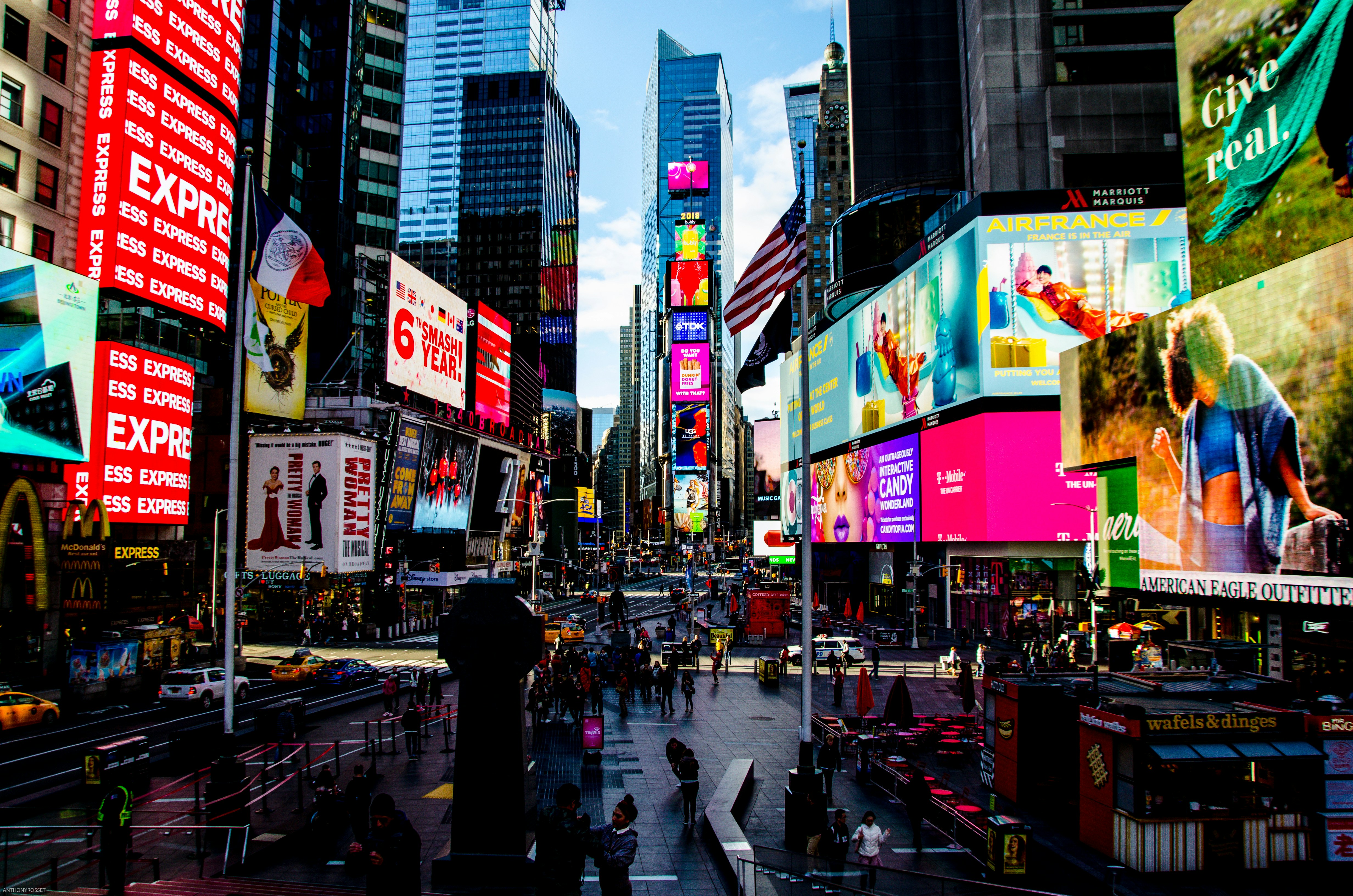
One reason inexperienced design often becomes crowded is that empty space can feel unfinished. A quiet composition appears to offer fewer opportunities to demonstrate effort, so additional elements are introduced to make the design feel more complete.
Experienced designers are often more comfortable allowing one element to carry the page.
Restraint is the confidence to believe the strongest idea does not need constant support.
Many sophisticated visual systems rely heavily on typography because type can create hierarchy, personality, rhythm, contrast, and structure without introducing additional graphic elements.
A change in scale can separate ideas. Weight can establish importance. Line length can change pacing. Spacing can create relationships. A distinctive typeface can carry much of the personality that would otherwise require illustration or ornament.
When typography is doing its job well, the design often needs less of everything else.
Whitespace is frequently described as empty space, but it is one of the most active tools in a composition. It separates unrelated ideas, connects related ones, creates emphasis, controls rhythm, and determines how dense or premium an experience feels.
Visual sophistication does not necessarily come from elaborate effects. It often comes from precision: consistent alignment, carefully tuned typography, controlled contrast, thoughtful image cropping, and subtle interaction details.
These decisions may be nearly invisible individually. Together, they create the feeling that the experience has been considered carefully.
The difference between ordinary and refined design is often measured in decisions most people never consciously notice.
Minimal design is sometimes assumed to be forgiving because there are fewer elements to manage. In reality, reducing the number of elements often makes each remaining decision more important.
When a page contains one headline, one image, and one button, there is nowhere for weak typography, poor spacing, or an awkward image crop to hide.
Complex compositions can sometimes disguise imperfections through visual activity. Simple ones expose them.
Much of design is initially additive. Ideas are generated. Layouts are explored. Content is collected. Features are proposed. Variations are tested.
The refinement process is often subtractive.
Removing elements without establishing hierarchy does not create clarity. It only creates less information.
Strong simple design makes priorities unusually clear. The viewer understands where to begin, what to notice next, and what action matters most.
That hierarchy can come from size, placement, contrast, motion, spacing, or sequencing. The visual language may be restrained, but the underlying structure is doing significant work.
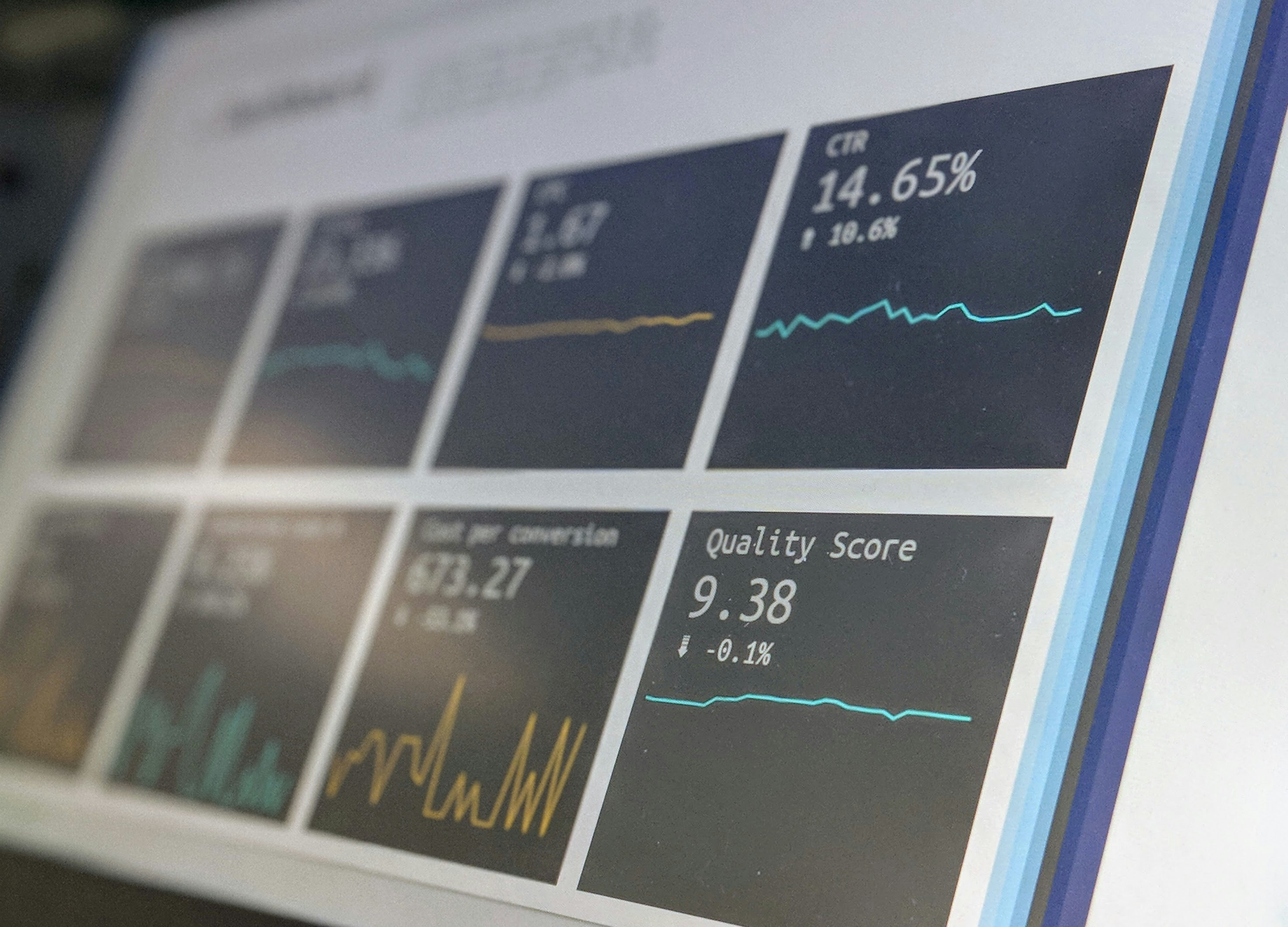
Some of the easiest products to use are built on complicated systems. Search engines process enormous amounts of information through a small input field. Payment experiences can hide several technical and regulatory processes behind a short sequence of screens.
The sophistication is not absent. It has been organized so the user does not have to manage it.
A simple interface can be evidence of a sophisticated system that knows which complexity belongs behind the scenes.
Not every premium design should be minimal. Some brands need richness, ornament, color, density, illustration, or expressive interaction. Simplicity is not a universal visual style.
What often distinguishes more mature work is intentionality. Whether the result is quiet or expressive, every element appears to have a reason for being there.
Design becomes weaker when minimalism turns into a rule rather than an outcome. Removing something simply to make a page look cleaner can damage usability just as easily as adding too much.
The objective is to find the amount of information, expression, and interaction the experience actually needs.
When that balance is resolved well, the final design can feel surprisingly simple. Not because little thought went into it, but because the thinking no longer gets in the way.
Filed under
Keep exploring
More stories from across the Bivi Journal.